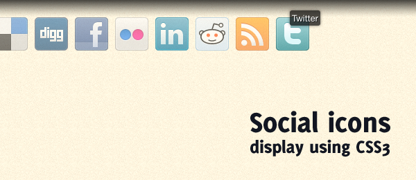
Although I didn’t like CSS animations at first, the more I work with it, the more I do like the way it’s implemented. A couple of days ago, I visited a website called Pubwich. The overall design of the website looks pretty good, but the part with the social media buttons attracted me even more. When you hover a icon, a small tooltip is displayed with the name of the social media. All other icons have a low opacity.
I wanted to take this concept and bring it to the next level using CSS3 transitions. The goal was to slowly fade-in and fade-out the opacity changing, and animate the position of the tooltip a little bit. With that in mind, I was able to create a beautiful social media icons display using CSS3.
The example works with all -webkit based browsers (Safari and Chrome), but also in Firefox 4. I’ve included a jQuery version as well, to be used as a form of "backward compatibility". You can also see how the same effect can be achieved using CSS and jQuery.
Although the code and effect is very minimal, it’ll give your website a very professional look. Let’s dive into the code to see how you can implement something like this on your own website. Take not this effect can be applied to more buttons as well, not only social media icons.
HTML
Our HTML, the backbone of the page, will be very clean and simple (as it should be). Here’s a piece of HTML we’re going to use.
<ul class="social">
   <li class="delicious">
      <a href="http://www.delicious.com/">
         <strong>Delicious</strong>
      </a>
   </li>
   <li class="digg">
      <a href="http://digg.com/">
         <strong>Digg</strong>
      </a>
   </li>
   <!-- More services -->
</ul>
As you can see, we use a simply unordered list with list items that contains the links. The only "strange" party would be the use of the strong-elements. We need this extra element for some CSS styling of the tooltip. A span-element could be used as well, but I prefer the strong one in this case.
Now let’s dive into some generic CSS classes both examples (CSS3 and jQuery) need.
CSS
The basic CSS isn’t that hard either. We’ll display the list in a row and change some display properties. This is the core of the generic CSS:
.social { list-style:none; }
.social li { display:inline; float:left; }
.social li a { display:block; width:48px; height:48px; position:relative; }
.social li a strong { position:absolute; left:20px; top:-1px;
   text-shadow:1px 1px 0 rgba(0, 0, 0, 0.75); background-color:rgba(0, 0, 0, 0.7);
   border-radius:3px; box-shadow: 0 0 5px rgba(0, 0, 0, 0.5);
}

li.delicious { background-image:url("../images/delicious.png"); }
li.digg { background-image:url("../images/digg.png"); }
Take note the text-shadow, rgba and border-radius are actually CSS3 properties, but I used them here as well (display of the tooltip). Since the parent of the strong element has a position:relative, we can position:absolute it and use the left and top properties easily.
Now on to the more interesting parts: The CSS3 animation!
CSS3
You might expect some heavy CSS3 going on over here, but that’s not true. The syntax of the CSS transition is actually that simply, that it doesn’t take that much room! Check it out:
.social:hover li { opacity:0.2; }

.social li { transition-property: opacity; transition-duration: 500ms; }
.social li a strong { opacity:0;
 transition-property: opacity, top; transition-duration: 300ms;
}

.social li:hover { opacity:1; }
.social li:hover a strong { opacity:1; top:-10px; }
We simply target a property that should be included in the animation. In our case, that’s opacity (for the icon) and opacity, top (for the tooltip). We also set the duration of the animation.
When hovering, we change the values of these properties. Since the transition-property has been set, the browser does all the animation for us! It’s as simple as that. When we "hover-out", the classes will be reverted again and the animation can be seen as well.
jQuery
In this case, jQuery can do the job as well (just in case a visitor comes to your website with a browser that doesn’t support the CSS3 transition). Although the effect is the same, we do need a lot more code and the jQuery library to be imported. Here’s the jQuery code I came up with:
// Hide all the tooltips
$("#jquery li").each(function() {
   $("a strong", this).css("opacity", "0");
});

$("#jquery li").hover(function() { // Mouse over
   $(this)
      .stop().fadeTo(500, 1)
      .siblings().stop().fadeTo(500, 0.2);

   $("a strong", this)
      .stop()
      .animate({
         opacity: 1,
         top: "-10px"
      }, 300);

}, function() { // Mouse out
   $(this)
      .stop().fadeTo(500, 1)
      .siblings().stop().fadeTo(500, 1);

   $("a strong", this)
      .stop()
      .animate({
         opacity: 0,
         top: "-1px"
      }, 300);
});
Now all your visitors will be able to see these social icons the beautiful way!
Conclusion and Download
I do think that this effect is an improvement compared to the original from Pubwich. Although the effect is minimal, it looks really good. Take note the actual demo contains some -webkit and -moz prefixes that are not included in the article. Dive into the code and see how the full CSS looks like! The same counts for the use of some ID‘s in the HTML, that are referenced by the HTML/JavaScript.
Overall, I really do like the CSS3 transitions in this example. It’s very short, clear and works perfect. You also don’t need to import a huge JavaScript library, and it works when the user is browser with JavaScript off.
What do you think of this example? Would you improve the code somewhere? Or don’t you like the CSS3 animations at all, and you would still stick with jQuery? Please share!

1 comments On Display social icons in a beautiful way using CSS3
Man you are a god at css….Am a 15 year old programmer,web developer and ethical hacker…you write amazing codes off heart
You’re my role model and I think you’re the best at css so far