More and more CSS3 articles are popping up on Marcofolio and all across the web. Although CSS3 is just future talk (since not all browsers support it yet), it’s pretty cool to get a sneak peak on what the future will hold for us.
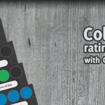
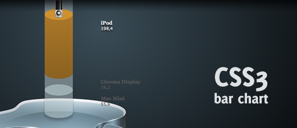
While browsing the web, I came across a pretty cool 3d bar chart created with Flash. I was wondering if I could recreate the same neat effect using pure CSS3 and started working on this wicked CSS3 3d bar chart. Check out the example to see that (almost) no images were used to create this wicked effect.
The only images that are used in this example, were taken from the Superpack icon pack and only show the Apple icons. Everything else you see in this demo, is created using pure CSS3.
This example only works in the latest versions of Firefox, Chrome, Safari and Opera. Since Internet Explorer still doesn’t fully support CSS3, this example looks a bit weird in IE. So, for now, this is just another sneak peak into the future. Let’s check out how you can create this!
Video
Here’s an example of the page showed in the latest version of Firefox (3.6). It shows all the effects as they should show (rounded corners, gradients, shadow, rgba etc.)
I guess I warmed you up on how you could create something like this yourself, haven’t I? Let’s take a look under the hood.
HTML
As usual, we want to keep our HTML clean and tidy. This is what we’re going to use:
<ul id="bar">
   <li id="iphone">
      <div class="top">
         <img src="images/iphone.png" alt="iPhone" />
      </div>
      <div class="bottom">
         <div class="infobox">
            <h3>iPhone</h3>
            <p>80,1</p>
         </div>
      </div>
   </li>
   <!-- More bar chart items -->
</ul>
As you can see, we’re simply using an unordered list that contains several items (the bars). Each bar contains from two segments: The Top and the Bottom. We’ll use the magic of CSS to style the top (which also contains the image) to an ellipse (top of the bar). The bottom (the bar body), that contains the info of the bar, will be styled to have a pretty rounded border too.
The HTML itself is pretty boring (which it should be!), and we’ll let CSS(3) do it’s magic to make the page look beautiful.
CSS
Before we start digging through the CSS, I would like to note that I only discuss the most interesting/important stuff in this tutorial. All the CSS needed to create the exact same page can be found in the download and/or demo.
First, we’ll need to clear some default list stuff from the CSS. This prevents the "dots" you would normally see on lists.
#bar { list-style:none; }
That took care of that. Now, let’s get ready to style the top of each bar. Take note these are the generic classes applied to each bar; We’ll discuss the specific things later.
#bar li div.top { background-color:rgba(140,172,176,0.5); position:relative;
   width:100px; height:40px; -moz-border-radius: 100px/40px; -webkit-border-radius: 100px 40px; border-radius: 100px/40px; }
#bar li div.top img { display:none; }
Now this is where it gets interesting. We apply a half-transparent background-color using rgba (last value is opacity). We need this transparency since we need to stack all the bars on top of each other and still see the color that is underneath. We also set the position to relative, since we need to specify the z-index later.
We set the top box to a specific size (100 x 40). We than use the CSS3 border-radius property to create rounded corners. Because we pass on two values, we’re able to create an ellipse (which is what we need). Take note of the different -moz- and -webkit- implementations. I don’t know why this is different (one uses a space, the other one a dash).
The image of the top has been hidden with display set to none. We’ll show it on hovering the item. We now created an ellipse for the top of the bar. Now, let’s move on to the body (bottom) of the bar.
#bar li div.bottom { background-color:rgba(184,203,205,0.5); margin-top:-40px; position:relative;
   width:100px; -moz-border-radius: 100px/40px; -webkit-border-radius: 100px 40px; border-radius: 100px/40px; }
Just like with the div.top, we apply a half-transparent background-color using rgba. We shift the bottom a little bit up (margin-top:-40px;) to place it directly under the top. We apply only the width (height will be set differently for each item) and we apply the same kind of rounded corners to match the ellipse from the top.
The last generic CSS thing we now need, is to display the image once we’re hovering. One line of code will deal with that:
#bar li:hover div.top img { display:inline; }
That’s all the CSS we need for the generic things. Now we need to move on to some specific values, that’s why we have some separate id in the HTML (like id="iphone">).
#iphone div.top { z-index:99; }
#iphone div.bottom { z-index:98; height:150px; }
#iphone:hover div.top { z-index:999; background-color:#1f81ac; }
#iphone:hover div.bottom { z-index:998; background-color:#1a6c90;
   background:-moz-linear-gradient(-90deg, #1a6c90, #14506b); background:-webkit-gradient(linear, 0 top, 0 bottom, from(#1a6c90), to(#14506b)); }
First, we apply the z-index of the top and the bottom elements. The top always have to be greater than the bottom to stick on front, and the next items (macbook etc.) have to be smaller. This way, we can control what is placed in front and what not. As you can see, when we :hover the item, we bring the elements completely to the front (since we need to overrule the z-index of the next bar).
A specific height is set for the bottom, depending on how big you want your chart to be. We give the top a fixed background-color when hovering (no transparancy) and the bottom gets a fancy gradient (take note of the once again different -moz- and -webkit- implementations).
Almost done with our 3d bar chart: I’ve added a couple of minor things to make it complete.
/* First top should have a different colour */
#bar li:first-child div.top { background-color:rgba(186,211,215,0.5); }

/* Last bottom should have a shadow */
#bar li:last-child div.bottom { -moz-box-shadow: 0 10px 10px hsla(0,0%,0%,.2); -webkit-box-shadow: 0 100px 30px hsla(0,0%,0%,.2); box-shadow: 0 100px 30px hsla(0,0%,0%,.2); }
The first .top should have a different colour, since there’s nothing on it’s background. Since we’re using transparancy, we slightly need to change it (using :first-child pseudo selector) to set it to the correct value. Just for extra fanciness, we apply a shadow at the bottom using :last-child pseudo selector. Also, take note of the use of the hsla colour property here; it was just easy to use.
Well, that’s all it takes to create this fancy looking 3d CSS3 bar chart. Take a look in my CSS how to display the .infobox elements the way they’re shown in the demo and you’re ready to go.
Conclusion and Download
Although not all browsers support this effect, it’s pretty cool to see what CSS3 can achieve. One small downside of this script, is that the bottom bar can’t be smaller than the height of the top bar. Other than that, I think it’s a really wicked effect I would love to see on more websites.
What do you think of this technique? What else would you like to see in this CSS? Feel free to share your thoughts!