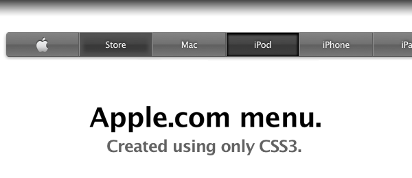
A while ago (I think it was around the release of the iPad), the Apple.com website got a new navigation menu on the top of the page. This menu bar was a lot darker than the previous, grey version, but looks just as great. One thing which I noticed about the navigation, is that the buttons are created out of images. That’s the moment I thought we could do better, using some nifty CSS3 techniques. So today, I present you …

