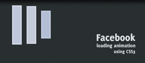
After the couple of jQuery Quickies that have been placed online on this website, I today present you a CSS3 quickie. Just a short walkthrough to create a simple effect, to learn some basic stuff. In this case, we’re recreating the Facebook loading animation using CSS3 animations. I’m pretty sure that you’ve seen the animation before, if you’re a Facebook user.
We’re using CSS3 keyframes to create the desired effect. We’ll be using prefix free from @LeaVerou to use unprefixed CSS3 properties.
Take note this example only works properly in browser that support the keyframes property. I’ve tested this script and verified that it’s working in the latest versions of Firefox, Chrome and Safari.
The source
The source code for this animation is actually pretty simple. I’ve added comments to make things clear.

<!-- Facebook Loader -->
<div class="loader">
    <div class="bar"></div>
    <div class="bar"></div>
    <div class="bar"></div>
</div>
/* FACEBOOK LOADER */
.loader { width:32px; height:32px; }

/* Initial state */
.bar {
    background-color:#99aaca; border:1px solid #96a6c9; float:left;
    margin-right:4px; margin-top:6px; width:6px; height:18px;

    /* Set the animation properties */
    animation-duration: 1s;
    animation-iteration-count: infinite;
    animation-name: loadingbar;
}

/* Delay both the second and third bar at the start */
.loader .bar:nth-child(2) { animation-delay: 0.1s; }
.loader .bar:nth-child(3) { animation-delay: 0.2s; }

/* The actual animation */
@keyframes loadingbar {
     0% { }
    10% { margin-top:5px; height:22px; border-color:#d1d8e6; background-color:#bac5db; }
    20% { margin-top:0px; height:32px; border-color:#d1d7e2; background-color:#c6ccda; }
    30% { margin-top:1px; height:30px; border-color:#d1d8e6; background-color:#bac5db; }
    40% { margin-top:3px; height:26px; }
    50% { margin-top:5px; height:22px; }
    60% { margin-top:6px; height:18px; }
    70% { }
    /* Missing frames will cause the extra delay */
    100% { }
}

That’s all we need! Take note the example uses Prefix free to use unprefixed CSS3 properties, otherwise you would have added prefixes like -webkit-, -moz- etc.
Conclusion & Download
Although I can’t find out the specific framerate/speed, I think this animation is pretty cool. Could you make it any better (example: Use less/no extra HTML elements, think about using pseudo elements)?
I hope you learned a little bit more from this CSS3 quickie!


4 comments On CSS3 quickie: The Facebook loading animation
Pingback: 150 Amazing Examples of CSS Animation & Effects ()
Pingback: 150+ Amazing Examples of CSS Animation & Effects - Web Design Tips ()
Pingback: 150+ Amazing Examples of CSS Animation & Effects - WP Epitome ()
Pingback: 150 Amazing Examples of CSS Animation & Effects – Website Design – India ()