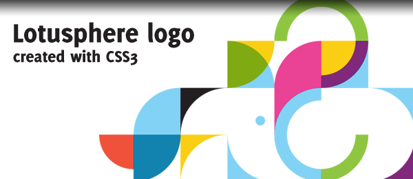
A while ago, I visited the IBM Lotusphere 2012 conference page. One thing that I noticed immediately, was their beautiful logo on the background. Although it’s design is very minimal and simple, the logo just looks very good.
I wanted to recreate this logo using only HTML and CSS3. The main key to this effect is using the border-radius and overflow:hidden properties. I’ve created two versions: One that uses extra HTML elements, the second one uses CSS3 pseudo elements.
Check out the demo to see how the logo looks like in your browser. Keep in mind, no images are used at all. Feel free to dig in the source code as well and maybe learn a couple of things.
Let’s take a look under the hood to see how you can create something like this yourself. It’s actually easier that it might look!
The grid
The first thing you’ll need to see is that the logo is actually painted on a grid. I’ve used the following image as a reference for myself to see what shapes are included.

Now it’ll become a lot easier for us. Each grid block has the size of 76x76px. We’ll simply convert this to some HTML and CSS.

<div class="block"></div>
.block { width:76px; height:76px; background-color:#fff;
    float:left; overflow:hidden; }

Like I said before, one of the key features is the overflow:hidden property from this box. This way, we can place our shapes inside the boxes and move them around, without going outside it’s boundaries. The grid also gives us another great thing: We can identify the blocks by it’s position using the X and Y coordinates. For example, I used ID’s like this: x10y02 (10th column, 2nd row).
The shapes
Now, when you look closely in the grid, you’ll find it only consists of a couple of different shapes. They are all the same, although some are rotated and have a different colour. Let’s take a look at how they look like.
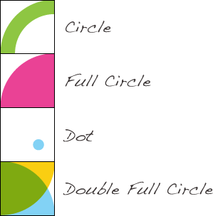
The dot and the double full circle are only used once, the other two are used more. Let’s see how you can create these shapes!

<div id="xy1" class="block">
    <div class="circle topRight"></div>
</div>
<div id="xy2" class="block">
    <div class="fullCircle"></div>
</div>
<div id="xy3" class="block">
    <div class="dot"></div>
</div>
<div id="xy4" class="block">
    <div class="fullCircle bottomRight"></div>
    <div class="fullCircle topRight overlay"></div>
</div>
/* General properties */
.circle { width:112px; height:112px;
    border-radius:50%; border-width:20px; border-style:solid; }
.fullCircle { width:152px; height:152px;
    border-radius:50%; }
.dot { width:15px; height:15px;
    border-radius:50%; }

/* Positioning */
.topRight { margin-left:-76px; }
.bottomRight { margin-left:-76px; margin-top:-76px; }
.bottomLeft { margin-top:-76px; }

/* Specific properties */
#xy1 .circle { border-color:#8ec642; }

#xy2 .fullCircle { background-color:#ea4295; }

#xy3 .dot { background-color:#82d2f5; margin-left:45px; margin-top:45px; }

#xy4 .fullCircle { background-color:#face12; }
#xy4 .overlay { background-color:#1183ae; position:relative; top:-76px; opacity:0.6; }

By using the topRight, bottomRight and bottomLeft classes, we can "rotate" the shapes. Using the specific properties, we can give the elements some colour. As you can see, the circle uses an border, while the full circle has just a background-color set. Now that you know this, you can dive in the code to see how all other specific blocks are created!
Pseudo elements
Although this example already uses way too many HTML elements, I wanted to reduce this number by using CSS3 pseudo elements. It allows us to create elements :before or :after the specific element. This was the HTML and CSS which was left (where the "p" prefix stands for Pseudo):

<div id="pxy1" class="block pCircle pTopRight"></div>
<div id="pxy2" class="block pFullCircle"></div>
<div id="pxy2" class="block pDot"></div>
<div id="px4" class="block"></div>
/* General properties */
.pCircle:after { content:''; display:block; width:112px; height:112px;
    border-radius:50%; border-width:20px; border-style:solid; }
.pFullCircle:after { content:''; display:block; width:152px; height:152px;
    border-radius:50%; }
.pDot:after { content:''; display:block; width:15px; height:15px;
    border-radius:50%; }

/* Positioning */
.pTopRight:after { margin-left:-76px; }
.pBottomRight:after { margin-left:-76px; margin-top:-76px; }
.pBottomLeft:after { margin-top:-76px; }

/* Specific properties */
#pxy1:after { border-color:#8ec642; }

#pxy2:after { background-color:#ea4295; }

#pxy3:after { background-color:#82d2f5; margin-left:45px; margin-top:45px; }

#pxy4:before { content:''; display:block; width:152px; height:152px; border-radius:50%;
    margin-left:-76px; margin-top:-76px; background-color:#face12; }
#pxy4:after { content:''; display:block; width:152px; height:152px; border-radius:50%;
    margin-left:-76px; background-color:#1183ae; position:relative; top:-76px; opacity:0.6; }

As you can see, the HTML looks way more clear and the CSS hasn’t changed that much. This is another example to show how great pseudo elements really are.
Conclusion & Download
Overall, I think it’s a neat way to display the logo without using any images. Especially the CSS3 Pseudo elements example uses some extra clean HTML. Sadly, I couldn’t get the correct green colour for the double full circle by using opacity and the yellow/blue colours. I’m also pretty sure the code can be optimized in some ways.
Do you know a better way to create the double full circle colour? If so, please share it with us! Or do you know another great way to achieve the same effect? I’m looking forward to it.



4 comments On Recreating the IBM Lotusphere logo in CSS3
Pingback: 150 Amazing Examples of CSS Animation & Effects ()
Pingback: 150+ Amazing Examples of CSS Animation & Effects - Web Design Tips ()
Pingback: 150+ Amazing Examples of CSS Animation & Effects - WP Epitome ()
Pingback: 150 Amazing Examples of CSS Animation & Effects – Website Design – India ()