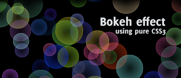
Bokeh – In photography, bokeh is the blur, or the aesthetic quality of the blur, in out-of-focus areas of an image, or "the way the lens renders out-of-focus points of light." (from Wikipedia). I’m pretty sure you’ve seen this effect before, since there are loads of wallpaper roundups and tutorials using this technique. Currently, one of my favourite wallpapers has to be this bokeh effect from -kol.
Today, I want to add another addition to the bokeh "hype", by creating a pure CSS3 bokeh effect. With some help from jQuery, we can add some randomness in colour, size and position for the effect.
Still don’t know what we’ll be creating? Make sure to check out the demo and view the source code to learn some more.
The effect looks pretty neat, doesn’t it? Check out this tutorial on how you can create it yourself! For those people who use IE, I’ve added a little video showing the full effect.
Video: Pure CSS3 bokeh effect
This is a small video I created to show the effect to user who don’t have (the latest version of) Firefox, Chrome or Safari.
If you are using a modern browser, you could check out the demo page and play with it yourself. Now let’s see how to create this kind of effect.
Step 1: HTML + Basic CSS.
First, the easy steps. Since we’re creating two kind of bokehs, we’ll work with two HTML elements; One that will hold the plain bokeh, the other one will be the gradient bokeh.
<div class="bokeh" id="plain"></div>
<div class="bokeh" id="gradient"></div>
Now, we’ll need to apply some CSS to the bokeh class that we can re-use on both bokehs.
.bokeh { width:100px; height:100px; background-color:white;
   -moz-border-radius:50px; -webkit-border-radius:50px; border: 1px solid orange; }
The border radius is 50% of the width/height of the element, making the element a full circle. This is what we got so far:
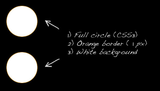
This is something we can work with to create the bokeh effect. Take note the orange border is added in this example; We’ll need to change that later on. Let’s move on to the next step!
Plain bokeh
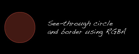
Let’s focus on the simple version of the bokeh first – the plain one. We’ll be using the CSS3 rgba property for this one (just like we used it on the sweet tabbed navigation). It allows us to set the colour in RGB, and the last parameter will be the opacity (I’ve removed the background-color and border properties from the previous code).
#plain {
   border: 1px solid rgba(240, 60, 60, 0.7); background-color: rgba(240, 60, 60, 0.3);
}
Now, we’ve created a see-through circle with a see-through border that we can use as our bokeh!
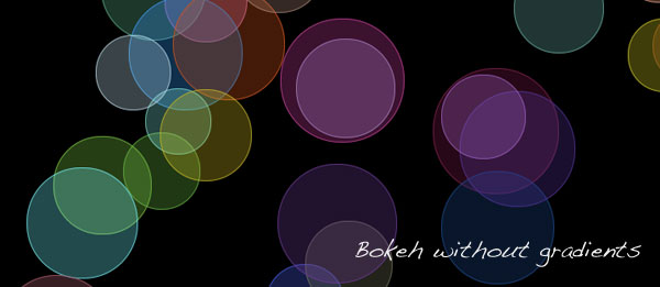
Now, we need to create multiple bokehs and place them on top of each other to improve the effect.
More plain bokehs
Since we want to add more bokehs, let’s make some changes to the HTML (I’ve removed the gradient one temporarily).
<div class="bokeh" id="plain1"></div>
<div class="bokeh" id="plain2"></div>
<div class="bokeh" id="plain3"></div>
<div class="bokeh" id="plain4"></div>
<div class="bokeh" id="plain5"></div>
Since we need to elements on top of other elements, we’ll need to use absolute positioning. We’ll also add another colour, just to see the effect better. Check out the following CSS:
.bokeh { width:100px; height:100px; position: absolute;
   -moz-border-radius:50px; -webkit-border-radius:50px; }

#plain1 {
   border: 1px solid rgba(240, 60, 60, 0.7); background-color: rgba(240, 60, 60, 0.3);
   top:50px; left:50px;
}
#plain2 {
   border: 1px solid rgba(250, 250, 0, 0.7); background-color: rgba(250, 250, 0, 0.3);
   top:77px; left:34px;
}
#plain3 {
   border: 1px solid rgba(240, 60, 60, 0.7); background-color: rgba(240, 60, 60, 0.3);
   top:150px; left:80px;
}
#plain4 {
   border: 1px solid rgba(240, 60, 60, 0.7); background-color: rgba(240, 60, 60, 0.3);
   top:120px; left:200px;
}
#plain5 {
   border: 1px solid rgba(250, 250, 0, 0.7); background-color: rgba(250, 250, 0, 0.3);
   top:80px; left:140px;
}
This will give us the following result:
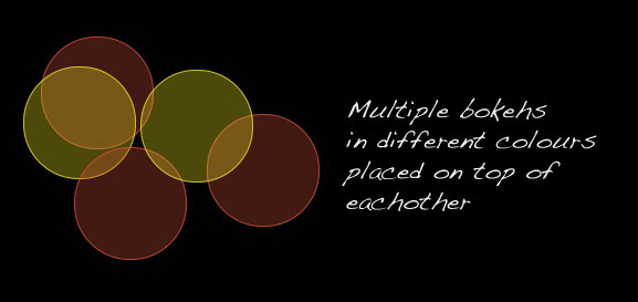
Looks pretty neat, doesn’t it? Using only this, we could fill up an entire page with several bokeh circles!
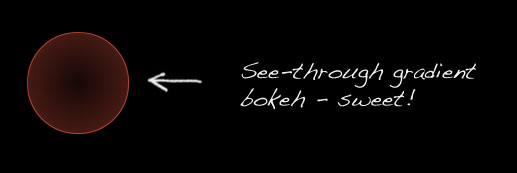
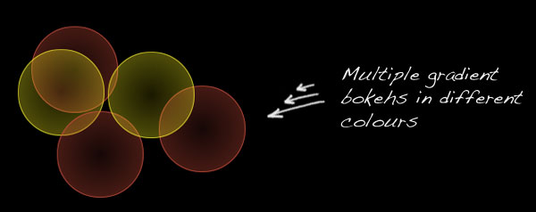
The gradient bokeh
CSS3 also allows us to create gradients (in Firefox supported by v3.6). Let’s use this fact for our advantage and create a gradient bokeh. Consider the following CSS:
#gradient {
   border : 1px solid rgba(240, 60, 60, 0.7);
   background: -moz-radial-gradient( rgba(240, 60, 60, 0.1), rgba(240, 60, 60, 0.4));
}
The -moz-radial-gradient allows us to set a from and a to colour. By once again using some RGBA, we can create the see-through effect here too. This piece of code will result in the following effect:
But there is just one catch here: This code now only works in Firefox (because of the -moz prefix). We can’t simply add another background property (supporting the -webkit prefix), since the other one will be overwritten. How can we make this work in Safari/Chrome too?
I found a nifty little workaround to make this work in -webkit browsers too. Simply apply the correct gradient syntax (which is different in webkit than the moz) to the background-image property and you’re ready to go.
So, when using the following code, we can make gradients work on both Firefox and webkit browsers:
#gradient {
   border : 1px solid rgba(240, 60, 60, 0.7);
   background: -moz-radial-gradient( rgba(240, 60, 60, 0.1), rgba(240, 60, 60, 0.4));
   background-image: -webkit-gradient(radial, center center, 0, center center, 70.5, from(rgba(240, 60, 60, 0.1)), to(rgba(240, 60, 60, 0.4)));
}
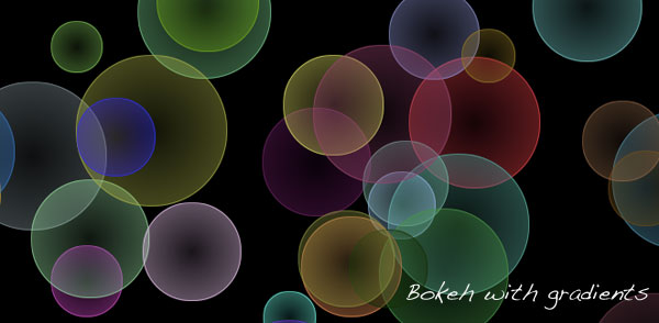
Using the same technique as with the plain bokehs, we can change the colour and place them on top of each other. Your result may look like this:
Of course, you can play with the bokeh size too. But there we have it already; a full bokeh effect using pure CSS and HTML! Now let’s do some jQuery to add some more spice to this example, by adding randomness in colour, size and position.
jQuery – Preperations
Of course, we could type our whole HTML and specify a different CSS class to each bokeh element to create a true bokeh effect. But it would be way more fun to create a random effect! In this stage, we’ll take a look at how we can create random colours, size and place the bokeh on a random position.
For the random size and random colour, I used two function from several websites. You might want to take a look at them to see how they work, since we’ll call them from our own function later.
// Function to get a random value between two values
function randomXToY(minVal,maxVal,floatVal) {
  var randVal = minVal+(Math.random()*(maxVal-minVal));
  return typeof floatVal=='undefined'?Math.round(randVal):randVal.toFixed(floatVal);
}

// Function to generate a random colour in RGB
function randomColour() {
	var rint = Math.round(0xffffff * Math.random());
	return (rint >> 16) + ',' + (rint >> 8 & 255) + ',' + (rint & 255);
}
We need the first function (by roshanbh.com) to generate a random bokeh size between two values (min and max size). The second function (by develobert) is used to create a random rgb colour.
HTML and CSS reset
We’ll need a quick reset for our HTML and CSS, since we’re generating the CSS dynamically and modifying the DOM using jQuery. We’ll work with the following HTML:
<div id="bokehs">
   <!-- Bokeh will get injected dynamically using jQuery -->
</div>
Combined with the following CSS, we’re ready to go:
.bokeh { position:absolute; z-index:-1; }
We’re placing each .bokeh element in a z-index of -1, to keep the title and options screen on top. All other properties that we learned in our previous steps (where we learned how to create the actual bokeh using pure CSS) will be generated by jQuery.
jQuery
This is the jQuery script I came up which will be executed on load. It generates all the randomness you’ll need to achieve the effect. I’ve added comments in the source code, so you’ll understand what it’s doing.
// Master function that paints all the bokeh effects
function repaint() {

   // Variables to generate the bokehs
   var numberOfBokehs = 100;
   var bokehMinSize = 50;
   var bokehMaxSize = 150;
   var orbColour = '10, 30, 70'; // Dark blue if no random colours are used
   var useRandomColours = true;
   var useGradients = false;

   // Generate the bokeh orbs
   for(var i = 0; i < numberOfBokehs; i++) {

      // Generate a random bokeh size
      var bokehSize = randomXToY(bokehMinSize, bokehMaxSize);

      if(useRandomColours) {
         // Generate the random bokeh colour
         var bokehColour = randomColour();
      } else {
         // Use the given RGB code
         var bokehColour = orbColour;
      }

      // Create the bokeh
      var bokeh = $("<div />")
         .addClass("bokeh")
         .css({
               // Use the max screen width and height to position the bokeh
               'left' : Math.floor(Math.random()* screen.width ) + 'px',
               'top' : Math.floor(Math.random()* screen.height ) + 'px',
               'width' : bokehSize + 'px',
               'height' : bokehSize + 'px',
               '-moz-border-radius' : Math.floor(bokehSize)/2 + 'px',
               '-webkit-border-radius' : Math.floor(bokehSize)/2 + 'px',
               'border' : '1px solid rgba(' + bokehColour + ', 0.7)'
            });

      if(useGradients){
         bokeh.css({
            // Gradients for Firefox
            'background' : '-moz-radial-gradient( contain, rgba('+ bokehColour +', 0.1), rgba(' + bokehColour + ',0.4))',
            // Freaking ugly workaround to make gradients work for Safari too, by applying it to the background-image
            'background-image' : '-webkit-gradient(radial, center center, 0, center center, 70.5, from(rgba('+ bokehColour +', 0.1)), to(rgba(' + bokehColour + ',0.4)))'
         });
      } else {
         bokeh.css({
            'background' : 'rgba(' + bokehColour + ', 0.3)'
         });
      }

      // Append to container
      bokeh.appendTo("#bokehs");
   }
}
That's about it! On the demo page, I've made the variables attached to the user input, so they can decide what's going to happen. You can take a look in the code by downloading the source. You can now "create" (or generate) effects like this:
Or input your own colour! Pretty awesome, isn't it?
Conclusion and Download
Next to playing with colour, size and selecting whether to use gradients or not, you could also add the functionality to (randomly) choose the opacity of each bokeh. Other than that, I think this is a pretty neat effect to see. Maybe to very useful on actual webpages, but it does show the power of CSS3 (combined with jQuery).
In the final version, I've added some configuration options for the user too. What do you think of this script? There is always room for improvement, so feel free to share anything.